Text rendering in Windows Presentation Framework has been a moot point since its release. Microsoft are responding to this and in WPF 4.0 text rendering will be performed by DirectWrite, some new bit of DirectX. But still, while working on reproducing a mockup done in Corel PHOTO-PAINT, I wanted to get to the bottom of why I am never happy with WPFs rendition and whether I am just imagining the whole thing.
My original mock-up was done in Corel's Photoshop equivalent at a very high resolution and then I view it in a normal viewer like Windows Live Photo Gallery and zoom it down to the right size.
I then compare my WPF work with the mockup PNG side-by-side and usually squint and shake my head alot.
So I created the same thing in CorelDRAW and Microsoft Word, giving me a total of 4 versions of the same mockup. Here's what I discovered.

For me, Corel's versions are the nicest. I just like them more, in the way that I prefer one woman's face over another. It's subtle and innate.
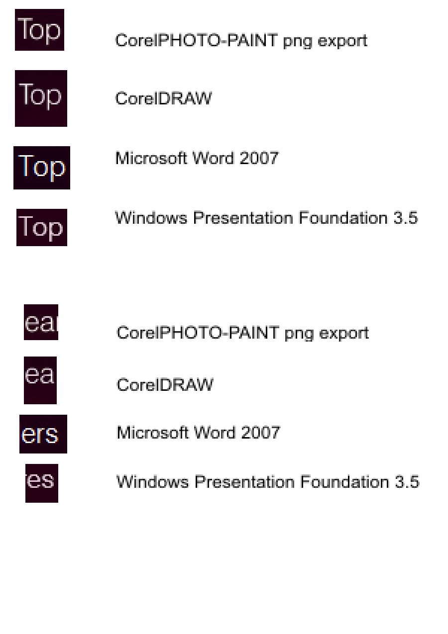
Philosophy aside, the WPF version and the Corel could easily be mistaken for different typefaces. They're both Swiss 721 Lt BT. Here's my analysis:
- Corel renders the O under the T, probably because it doesn't need to consider text selection. This is it primary advantage.
- Corel apps and Word seem to render the lowercase glyphs slightly larger (1px) so that there is less of a difference in height to the uppercase T.
- The top right end of the s in WPF sinks down, caused by confused anti-aliasing.
- Word uses coloured anti-aliasing, blue on one side of the T and red on the other - the others do not.
- WPF renders the thickest, most woolly lines.
- WPF also renders the horizontal bar in e lower than the others, probably because it is slightly smaller and the bar snapped down a pixel.
As far as I see it, the fact that Microsoft Word can render the text quite accurately, the issue is not solely about ClearType but something inherent in WPF. It's a shame that text cannot be tuned per XAML element with varying amounts of anti-aliasing instead of on/off.
I hope they work it out in 4.0.
Labels: programming, silverlight, user experience, wpf
0 comments:
Post a Comment